Cloud Phone Design

Design for Cloud Phone by adapting for small screens, supporting keyboard navigation, and leveraging familiar components and navigation patterns.
Small Screens
Cloud Phone runs on feature phones like the Nokia 235 4G and Itel R60+ 4G. Displays are smaller and less vibrant than Android or iOS smartphones.
Screen Specifications
Screen Specifications
- Dimensions: 1.8–2.8" (4.5–7.1cm)
- Colors: 64–256k
- Density: 102–200 ppi (pixels per inch)
- Refresh Rate: 60–120 Hz
- Contrast Ratio: <1000:1
- Brightness: ~400 nits
- Technologies: TFT and IPS LCD
- Resolutions
- QQVGA: 128x160
- QVGA: 240x320
- QVGA (square): 240x240
- QVGA (portrait): 320x240
Cloud Phone widgets are rendered full screen, without the System UI (i.e. status bar). To effectively support QQVGA screens, consider the following tips:
- Remove unnecessary chrome and large whitespace
- Use grids to scroll content horizontally and vertically
- Relocate less frequent actions to an options menu
- Choose high-contrast color combinations
- Scale down media to appropriate sizes
Keyboard Navigation
Cloud Phone devices a directional pad (D-pad) for navigation, similar to a TV remote control. There are five primary navigational keys.
| Key | Code | Symbol |
|---|---|---|
| Enter | 13 | ↵ |
| ArrowLeft | 37 | ← |
| ArrowUp | 38 | ↑ |
| ArrowRight | 39 | → |
| ArrowDown | 40 | ↓ |
Lists
Lists are simple. Pressing the ArrowUp and ArrowDown keys to move up and down a list, respectively. List items can be added continuously for infinite scrolling, or wrap around from start to finish, e.g. 20→1.
Users can also continuously press arrow keys to scroll faster. This fires multiple KeyboardEvents with the repeat property set to true.
Grids
Unlike lists, grids are scrolled with all four arrow keys. A few techniques can improve usability for large grids and ensure that every key press corresponds to an action.
Z-navigation wraps focus when across rows. ArrowRight on the last item in a row moves focus to the first item in the next row, i.e. 3→4. ArrowLeft does the reverse and moved to the previous row, e.g. 4→3.
Avoid row skipping. Pressing ArrowDown on the second to last row should move focus to the final row, even when there are missing items in the final row, e.g. 24→26.
D-Pad Navigation Tips
- Provide clear focus and selection styles
- Use a consistent accent/ outline color
- Only focus one element at a time
- Restore focus throughout navigation
- Only apply focus to focusable elements
Elements
Icons
Cloud Phone widgets must have a 24-bit, 512x512px non-transparent icon to be displayed in the all-widgets grid and list views of Cloud Phone, as well as throughout the platform. Widget icons are square, and the system applies masking to produce rounded corners. It’s recommended to maintain appropriate padding on each side to accommodate clipping and masking of the image edges used to produce the icon’s final shape.
See Cloud Phone UI & UX design guidelines for more information.
Icon Tips
- Use simple graphics that emphasize key features
- Avoid word marks or small text
- Select high-contrast colors that match your brand
- Fill in internal transparency
- Do not use photos or intricate 3D renders
- Add an outline to monochromatic logos
- Test icons against black, white, and photographic backgrounds
- Set opacity to 100%
Header
The header is always displayed at the top of the screen and serves multiple purposes. It can show the application name, page title, or the title of the currently focused element. This ensures users can quickly orient themselves and understand their position within the hierarchy.
Header style may vary based on the design and layout of your application. As a general rule to balance size with readability, it’s recommended that the header height be 20px on QQVGA and 40px on QVGA screens.
Title
It’s often difficult to display more than ~16-20 characters for a single line title on QQVGA screens, and ~20-24 on QVGA screens. Here are some best practices to consider for the usability and accessibility of your application.
- ✅ Use concise titles
- ✅ Marquee long titles
- ❎ Shrink to fit
- ❎ Truncate long titles
Techniques like truncation and shrink-to-fit may work well on desktop and high-resolution mobile devices. However, these methods can render text unreadable on tiny QQVGA and QVGA screens. Additionally, first-time internet users may struggle to interpret truncated text if they cannot infer the missing words.
Best practice is to create a marquee animation in CSS since the HTML <marquee> element is deprecated.
Marquee Animations
Use hardware-accelerated CSS properties like transform for smooth marquee animations. This technique works for text of any length.
<header>
  <span> This is a long title that should use a marquee animation </span>
</header>
Add a delay between iterations by starting the animation after a “pause” from 0-20%. Translate the inner <span> from 0% to a little bit more than 100% to create the effect that the text scrolls beyond the viewport.
@keyframes marqueeText {
  0%,
  20% {
    transform: translateX(0);
  }

  100% {
    transform: translateX(-105%);
  }
}

header.marquee {
  display: block;
  width: 100%;
  overflow: hidden;
}

header.marquee span {
  display: inline-block;
  white-space: nowrap;
  animation-name: marqueeText;
  animation-duration: 6000ms;
  animation-timing-function: linear;
  animation-iteration-count: infinite;
}RTL: reverse the marquee using the CSS animation-direction property for right-to-left (RTL) languages like Arabic.
Soft Keys
Cloud Phone devices have two Software Keys: left soft key (LSK) and right soft key (RSK). Soft keys are used for navigation. RSK is mapped to history.back(), similar to the back button in a web browser. LSK is defined by Cloud Phone widgets by capturing the Escape key. The Enter key in the center of the d-pad can be used to trigger a click event, or captured directly.
| Name | Key | Function |
|---|---|---|
| Left Soft Key (LSK) | Escape | Programmable |
| Right Soft Key (RSK) | N/A | history.back()/ Programmable |
| Enter | Enter | Programmable |
Back Event
Override the default RSK behavior with the global back event.
window.addEventListener("back", (event) => {
  event.preventDefault();
  // Handle SoftRight
});
This allows you to manually navigate your app without using the History API. For example, you can intercept the back event to show an exit confirmation modal.
Quit your widget by calling window.close(), or do not call event.preventDefault(). This allows the default behavior to exit when there is nothing to go back to.
window.addEventListener("back", (event) => {
  if (isSomethingToGoBackTo) {
    event.preventDefault();

    // Return to previous page
    goBackInTime();
  } else {
    // Quit widget
    window.close();
  }
});
Menu Icons
You can use the following Scalable Vector Graphics (SVG) icons in your applications. The currentColor keyword ensures icons automatically inherit the value of the color property used for text styling.
Menu ()
<svg width="16" height="16" viewBox="0 0 16 16" fill="none" xmlns="http://www.w3.org/2000/svg">
  <path d="M2 12H14V10.6667H2V12ZM2 8.66667H14V7.33333H2V8.66667ZM2 4V5.33333H14V4H2Z" fill="currentColor"/>
</svg>
Back ()
<svg width="16" height="16" viewBox="0 0 16 16" fill="none" xmlns="http://www.w3.org/2000/svg">
  <path d="M6 12.6667L6.93999 11.7267L3.88666 8.66667H14.6667V7.33333H3.88666L6.94666 4.27333L6 3.33333L1.33333 8L6 12.6667Z" fill="currentColor"/>
</svg>
Search ()
<svg width="16" height="16" viewBox="0 0 16 16" fill="none" xmlns="http://www.w3.org/2000/svg">
  <path d="M10.5033 9.50335H9.97667L9.79 9.32335C10.4433 8.56335 10.8367 7.57668 10.8367 6.50335C10.8367 4.11001 8.89667 2.17001 6.50333 2.17001C4.11 2.17001 2.17 4.11001 2.17 6.50335C2.17 8.89668 4.11 10.8367 6.50333 10.8367C7.57666 10.8367 8.56333 10.4433 9.32333 9.79001L9.50333 9.97668V10.5033L12.8367 13.83L13.83 12.8367L10.5033 9.50335ZM6.50333 9.50335C4.84333 9.50335 3.50333 8.16335 3.50333 6.50335C3.50333 4.84335 4.84333 3.50335 6.50333 3.50335C8.16333 3.50335 9.50333 4.84335 9.50333 6.50335C9.50333 8.16335 8.16333 9.50335 6.50333 9.50335Z" fill="currentColor"/>
</svg>
Settings ()
<svg width="16" height="16" viewBox="0 0 8 8" fill="none" xmlns="http://www.w3.org/2000/svg">
  <path fill-rule="evenodd" clip-rule="evenodd" d="M4.99325 3.58671C5.27991 2.77338 5.10658 1.82671 4.45325 1.17338C3.71325 0.433377 2.59325 0.30671 1.71991 0.780044L3.28658 2.34671L2.34658 3.28671L0.779914 1.72004C0.306581 2.60004 0.433247 3.71338 1.17325 4.45338C1.82658 5.10671 2.77325 5.28004 3.58658 4.99338L5.85991 7.26671C5.99325 7.40004 6.19991 7.40004 6.33325 7.26671L7.26658 6.33338C7.39991 6.20004 7.39991 5.99338 7.26658 5.86004L4.99325 3.58671Z" fill="currentColor"/>
</svg>
Margins
Cloud Phone devices have prominent bezels and recessed screens that cast shadows at display edges. Leave a minimum screen margin of 4pt for QQVGA and 8pt for QVGA devices.
Option Menu
- Clear Data
- Settings
- About
- Clear Data
- Settings
- About
The option menu is a pop-up component that allows users to perform common actions without leaving the current page. It provides a list of choices that are may be navigational–open the “About” page–or contextual–delete the currently-focused image.
The option menu is a full screen typically launched via LSK (Escape), with the first item focused initially. ArrowUp and ArrowDown select menu items and Enter performs the selected action.
Typography
Cloud Phone provides two weights of Roboto (regular and bold) and Roboto Condensed in black. You are welcome to use web fonts but should validate that fonts are readable on Cloud Phone.
Font Sizes
Cloud Phone uses a predetermined range of font sizes carefully calibrated to balance the emphasize of content while ensuring readability. Below are recommended font sizes for necessary components.
QVGA
| Style | Weight | Size |
|---|---|---|
| Header | Bold/700 | 24pt |
| Headline | Black/900 | 16pt |
| Body | Regular/400 | 16pt |
| Footnote | Regular/400 | 12pt |
QQVGA
| Style | Weight | Size |
|---|---|---|
| Header | Bold/700 | 14pt |
| Headline | Bold/700 | 12pt |
| Body | Regular/400 | 12pt |
| Footnote | Regular/400 | 10pt |
Dark Mode
Cloud Phone does not provide system settings for selecting a preferred theme. As a result, the CSS media queries for the prefers-color-scheme media feature will always return light because the user has not expressed an active preference. Dark mode is recommended to maximize readability on low-contrast screens.
Animations
Similar to Dark Mode, Cloud Phone does not provide system settings for reduced motion. CSS media queries for prefers-reduced-motion will always return no-preference. Animations are welcome in Cloud Phone widgets, but animation speed may be limited by network latency.
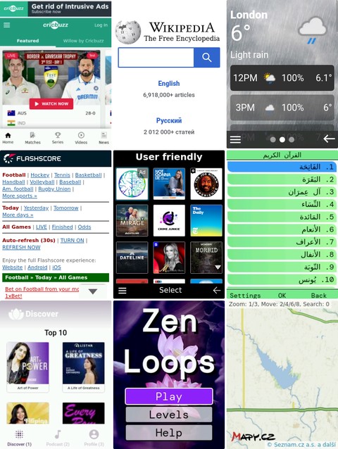
Summary
You can design intuitive and usable Cloud Phone widgets by following the tips and techniques in this guide. That said, these suggestions may be deliberately adjusted for brand conformance or to create a unique style. Here are a few screenshots of actual Cloud Phone widgets to get a sense of real-world design.
When your designs are ready, the Cloud Phone Simulator is a free tool you can use to to test and iterate on real-world Cloud Phone software.
Cloud Phone Simulator
Validate and iterate with the Cloud Phone Simulator