React

React is one of the most popular JavaScript framework in 2024. Learn how to build a Cloud Phone widget using React, or skip ahead to the finished sample code and live demo hosted on GitHub Pages.
Need a primer on Cloud Phone?
Getting started with Cloud Phone
Learn how Cloud Phone brings compelling web apps to the next billion users
Setup
Prerequisites
- Node & npm
- Git
- A GitHub account
Dependency Versions
This sample was developed using the following libraries and frameworks.
| Dependency | Version |
|---|---|
| Node | v20.11.0 (LTS) |
| npm | 10.9.0 |
| React | v19 |
| react-router | 7 |
| i18next | 24 |
| Vite | 6 |
Getting Started with Vite
Use Vite to scaffold a new React project.
npm create vite@latest cloudphone-react-sample -- --template reactYou can also use . for the project name to scaffold in the current directory.
Then follow the prompts to install dependencies into the node_modules/ directory.
Scaffolding project in ./cloudphone-react-sample...

Done. Now run:

  cd cloudphone-react-sample
  npm install
  npm run dev
The command npm run dev is aliased in the scripts section of the package.json file to run vite. This command starts a local HTTP server on port 5173 (by default), available at http://localhost:5173/
  "scripts": {
    "dev": "vite",
    "build": "vite build",
    "lint": "eslint .",
    "preview": "vite preview"
  }
Development
Routing
React Router by Shopify is one of the most popular packages for routing React apps. It supports both single-page apps (SPAs) as a library, as well as full-stack development and deployment including static and server-side rendering (SSR) as a framework.
Since Cloud Phone is already rendered on powerful servers, server-side rendering (SSR) is redundant and unnecessary.
In this demo, React Router is used as a library. Install react-router using NPM:
npm install react-routerThen in main.jsx, wrap the <App /> element with <HashRouter>.
import { StrictMode } from "react";
import { createRoot } from "react-dom/client";
import { HashRouter } from "react-router";
import "./index.css";

createRoot(document.getElementById("root")).render(
  <StrictMode>
    <HashRouter>
      <App />
    </HashRouter>
  </StrictMode>
);
The default <BrowserRouter> does not work with GitHub Pages but can still be used for self-hosted widgets. For GitHub Pages, use <HashRouter> instead.
Internationalization
react-i18next is a popular package for handling internationalization (abbreviated i18n) in React apps.
npm install react-i18next i18next i18next-browser-languagedetector --saveFor this demo, store translations as JSON files located at src/assets/locales/<language_code>/translation.json. Define a configuration like i18n.js below.
import i18n from "i18next";
import { initReactI18next } from "react-i18next";
import LanguageDetector from "i18next-browser-languagedetector";
import translationEN from "../assets/locales/en/translation.json";
import translationES from "../assets/locales/es/translation.json";

// Translations
const resources = {
  en: {
    translation: translationEN
  },
  es: {
    translation: translationES
  }
};

i18n.use(LanguageDetector).use(initReactI18next).init({
  resources,
  fallbackLng: "en"
});

export default i18n;
The demo includes two translations–English and Spanish–and uses the LanguageDetector package to automatically choose the default language based on the browser language.
Keyboard Navigation
Cloud Phones have directional pads (D-pads) to support keyboard navigation. Unlike desktop that uses the tabindex property and Tab (⇥) key to the next focusable element, Cloud Phone uses Arrow keys (↑↓←→).
 |  |
|---|
Autofocus on the first element in a page, list, or grid to set the user’s bearings. Use the autoFocus prop or a callback ref like below.
const autoFocus = (element) => element?.focus();

function AutofocusedLink({ url, text }) {
  return (
    <a href={url} autoFocus ref={autoFocus}>
      {text}
    </a>
  );
}

export default AutofocusedLink;
Extend the callback ref approach to autofocus on the first item in a list using this example from Tiger Oakes.
// CSS selector to find focusable elements
const FOCUSABLE_CSS_SELECTOR = `a[href], button:not([disabled]), input:not([disabled]), select:not([disabled]), textarea:not([disabled]), *[tabindex], *[contenteditable]`;

// Find the first focusable element in a container (i.e. list)
function findFirstFocusable(container) {
  return container.querySelector(FOCUSABLE_CSS_SELECTOR);
}

// Auto-focus the first focusable item in element when its mounted
function autoFocusFirstFocusable(element) {
  if (element) {
    findFirstFocusable(element)?.focus();
  }
}
This technique is used in the OptionsMenu component. Here is a simplified example:
import React, { useEffect, useRef, useState } from "react";
import { autoFocusFirstFocusable } from "../utils/focus";
function OptionsMenu({ children = [] }) {
const menuRef = useRef(null);
const [focusedIndex, setFocusedIndex] = useState(0);
// Autofocus on the first element in the list
useEffect(() => autoFocusFirstFocusable(menuRef?.current), [menuRef]);
return (
<>
<menu ref={menuRef} role="menu">
{React.Children.map(children, (child, index) =>
React.cloneElement(child, {
role: "menuitem",
className: index === focusedIndex ? "focused" : ""
})
)}
</menu>
</>
);
}
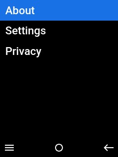
export default OptionsMenu;The OptionsMenu component can have children of any type, including React Router’s <Link> component or standard the HTML anchor <a> tag, to create a navigation menu triggered by the Left Soft Key (LSK)
const [menuVisible, setMenuVisible] = useState(false);

const onSoftKeyClick = (position) => {
  // Toggle menu visibility with Escape (␛)
  if (position === 'start')
    setMenuVisible(!menuVisible);
}

return (
  <OptionsMenu visible={menuVisible}>
    <Link to="about" replace>{t('About')}</Link>
    <Link to="settings" replace>{t('Settings')}</Link>
    <a href="https://www.cloudphone.tech/dev-privacy" target="_self">{t('Privacy')}</a>
  </OptionsMenu>

  <SoftKeyBar
    buttons = {{
      start: { icon: 'menu' },
      center: { icon: 'select' },
      end: { icon: 'back' },
    }}
    onSoftKeyClick={onSoftKeyClick} />
);
Hosting on GitHub Pages
GitHub Pages provides free hosting for public, open-source repositories. This demo uses the github-pages-deploy-action GitHub Action to build and deploy HTML, CSS, and JS to the gh-pages branch. The action is defined in pages.yml.
name: Deploy Pages
on:
  push:
    branches:
      - main
permissions:
  contents: write
jobs:
  build:
    runs-on: ubuntu-latest
    steps:
      - name: "Checkout 🛎️"
        uses: actions/checkout@v2
      - name: "Setup Node 🚧"
        uses: actions/setup-node@v4
        with:
          node-version: ">=20.11.0"
      - name: "Dependencies 🏗️"
        run: |
          npm ci
      - name: "Build 🔧"
        run: |
          npm run build
      - name: "Deploy 🚀"
        uses: JamesIves/github-pages-deploy-action@v4
        with:
          folder: dist
Wrap Up
Tips
Consider these tips if you are starting a React project from scratch.
- Use an accessible component library like Material UI (MUI) or Chakra UI
- Lazy-load translations dynamically over HTTPS with
i18next-http-backend - Reduce package size and page load time by switching to Preact
- Develop reliably with testing utilities like Enzyme
- Manage global state predictably with Redux
Next Steps
Register for the Cloud Phone Developer Program to try the live demo on the Cloud Phone Simulator or a physical device. Fork us on GitHub to start coding your first Cloud Phone widget using React and set up a custom domain name to point to GitHub Pages.